Checkbox
Custom components for rendering checkbox input
import { Checkbox, Text } from 'react-native-magnus'
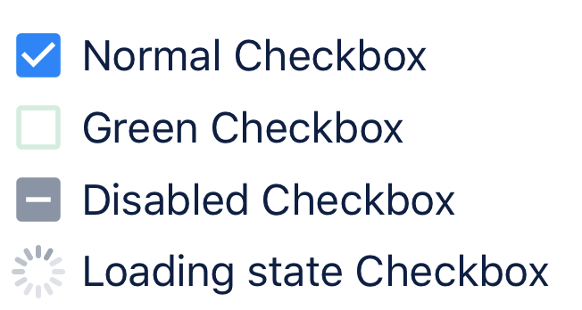
<Checkbox defaultChecked>
<Text>Normal Checkbox</Text>
</Checkbox>
<Checkbox activeColor="green500" inactiveColor="green300">
<Text>Green Checkbox</Text>
</Checkbox>
<Checkbox disabled >
<Text>Disabled Checkbox</Text>
</Checkbox>
<Checkbox loading>
<Text>Loading state Checkbox</Text>
</Checkbox>Props
| Property | Description | Type | Default |
|---|---|---|---|
| m | margin | string | number |
- |
| mt | margin top | string | number |
- |
| mr | margin right | string | number |
- |
| mb | margin bottom | string | number |
- |
| ml | margin margin left | string | number |
- |
| mx | margin horizonal | string | number |
- |
| my | margin vertical | string | number |
- |
| p | padding | string | number |
- |
| pt | padding top | string | number |
- |
| pr | padding right | string | number |
- |
| pb | padding bottom | string | number |
- |
| pl | padding margin left | string | number |
- |
| px | padding horizonal | string | number |
- |
| py | padding vertical | string | number |
- |
| rounded | border radius | string | number |
none |
| roundedTop | border radius top | string | number |
none |
| roundedBottom | border radius bottom | string | number |
none |
| roundedLeft | border radius left | string | number |
none |
| roundedRight | border radius right | string | number |
none |
| borderColor | color for border | string |
- |
| borderTopColor | color for border top | string |
- |
| borderRightColor | color for border right | string |
- |
| borderLeftColor | color for border left | string |
- |
| borderBottomColor | color for border bottom | string |
- |
| borderWidth | width for border | number |
- |
| borderTopWidth | width for border top | number |
- |
| borderRightWidth | width for border right | number |
- |
| borderLeftWidth | width for border left | number |
- |
| borderRightWidth | width for border right | number |
- |
| onPress | event triggered on pressing the checkbox | ((event: RNGestureResponderEvent) => void) | undefined; |
() => void |
| checked | state to control the state of checkbox | boolean |
- |
| loading | shows ActivityIndicator when true | boolean |
false |
| disabled | show disabled icon when true | boolean |
false |
| size | size for icon | string |
text700 |
| activeColor | color for icon when checkbox is checked | string |
blue600 |
| inactiveColor | color for icon when checkbox is unchecked | string |
gray400 |