Radio
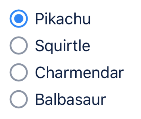
Custom components for rendering radio element.
import React, { useState } from "react";
import { Radio } from "react-native-magnus";

const [radioValue1, setRadioValue1] = useState(null);

<RadioGroup
  value={radioValue1}
  onChange={(value: any) => setRadioValue1(value)}
>
  <Radio value={1}>
    <Text>Pikachu</Text>
  </Radio>
  <Radio value={2}>
    <Text>Squirtle</Text>
  </Radio>
  <Radio value={3}>
    <Text>Charmendar</Text>
  </Radio>
  <Radio value={4}>
    <Text>Balbasaur</Text>
  </Radio>
</RadioGroup>;
Examples
Props
| Property | Description | Type | Default |
|---|---|---|---|
| m | margin | string | number |
- |
| mt | margin top | string | number |
- |
| mr | margin right | string | number |
- |
| mb | margin bottom | string | number |
- |
| ml | margin margin left | string | number |
- |
| mx | margin horizonal | string | number |
- |
| my | margin vertical | string | number |
- |
| p | padding | string | number |
- |
| pt | padding top | string | number |
- |
| pr | padding right | string | number |
- |
| pb | padding bottom | string | number |
- |
| pl | padding margin left | string | number |
- |
| px | padding horizonal | string | number |
- |
| py | padding vertical | string | number |
- |
| p | padding | any |
- |
| h | height | number |
- |
| w | width | number |
- |
| bg | background color | string |
- |
| minH | mininmum height | number |
- |
| minW | minimum width | string |
- |
| rounded | border radius | string | number |
none |
| roundedTop | border radius top | string | number |
none |
| roundedBottom | border radius bottom | string | number |
none |
| roundedLeft | border radius left | string | number |
none |
| roundedRight | border radius right | string | number |
none |
| borderColor | color for border | string |
- |
| borderTopColor | color for border top | string |
- |
| borderRightColor | color for border right | string |
- |
| borderLeftColor | color for border left | string |
- |
| borderBottomColor | color for border bottom | string |
- |
| borderWidth | width for border | number |
- |
| borderTopWidth | width for border top | number |
- |
| borderRightWidth | width for border right | number |
- |
| borderLeftWidth | width for border left | number |
- |
| borderRightWidth | width for border right | number |
|
| flex | flex property for container | number |
- |
| shadow | describe the depth of shadow to be used | number |
- |
| shadowColor | color for shadow | string |
- |
| justifyContent | describes how to align children within the main axis of their container | "flex-start"| "flex-end" | "center" | "space-between" | "space-around" | "space-evenly" |
- |
| alignItems | describes how to align children along the cross axis of their container | "flex-start" | "flex-end" | "center" | "stretch" | "baseline"; |
- |
| flexDir | controls the direction in which children of a node are laid out | "row" | "column" | "row-reverse" | "column-reverse"; |
column |
| flexWrap | controls what happens when children overflow the size of the container along the main axis | "wrap" | "nowrap" | "wrap-reverse"; |
nowrap |
| position | used to position the childrens | absolute" | "relative" |
relative |
| top | number of logical pixels to offset the top edge of this component. | number |
- |
| right | number of logical pixels to offset the right edge of this component. | number |
- |
| bottom | number of logical pixels to offset the bottom edge of this component. | number |
- |
| left | number of logical pixels to offset the left edge of this component. | number |
- |